Bloop
Logo & Brand DesignWhen I came up with the concept of Bloop, I reflected on my personal design journey, recognizing the pivotal role my 9th-grade art teacher, Mr. Perez, played in introducing me to graffiti and fine arts. I am deeply grateful for the resources and support I received during my creative development, realizing that this privilege is not universally available.
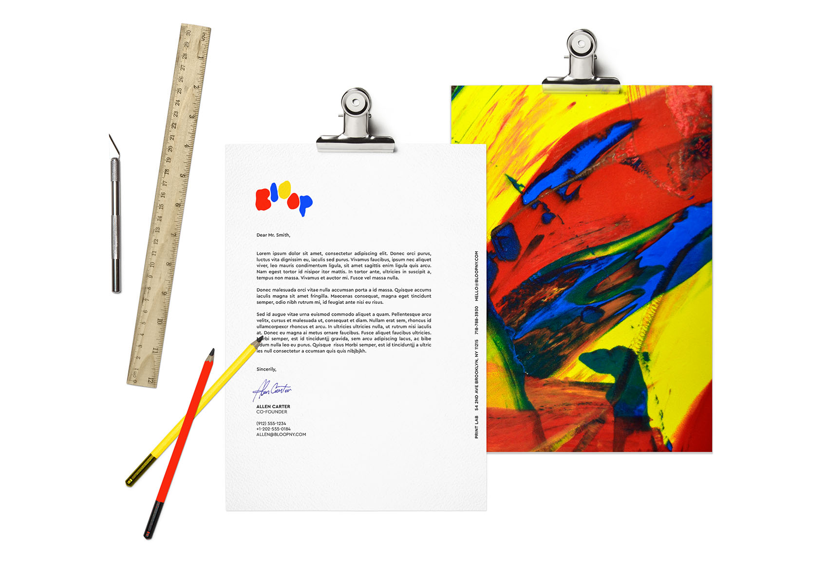
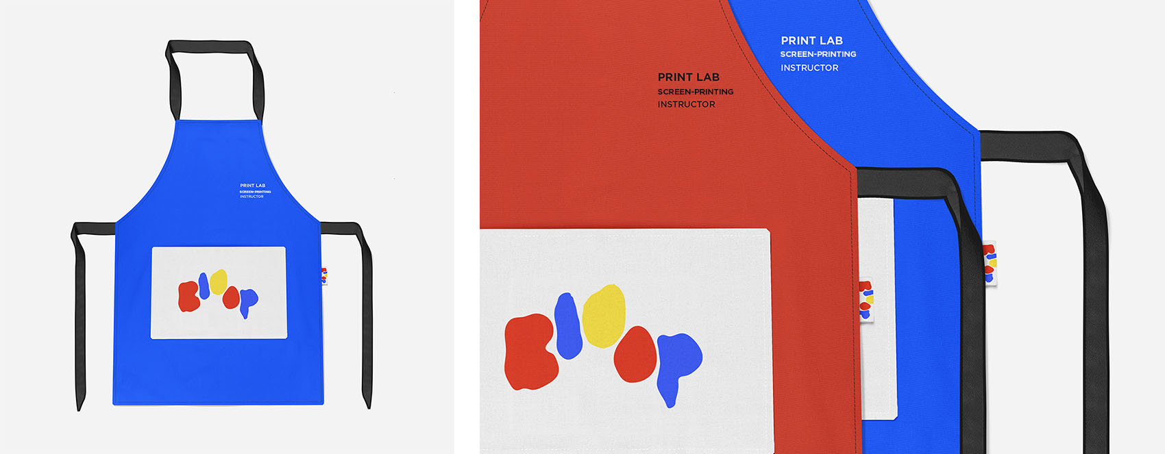
Bloop is a branding concept that encompasses both a screen printing lab and a co-op space, catering to the community. At Bloop, we believe in inspiring everyone to embrace their inner child and fearlessly engage in creative endeavors. The name and appearance of the Bloop logo draw inspiration from the sound of paint hitting the ground and its organic fluid shape. We chose primary colors to evoke a sense of nostalgia while maintaining a modern touch. Moreover, I learned early on that when you mix red, blue, and yellow, you can create any color imaginable. I envision art as an inclusive and attainable domain, welcoming not only established artists but also aspiring young talents.
Bloop is a branding concept that encompasses both a screen printing lab and a co-op space, catering to the community. At Bloop, we believe in inspiring everyone to embrace their inner child and fearlessly engage in creative endeavors. The name and appearance of the Bloop logo draw inspiration from the sound of paint hitting the ground and its organic fluid shape. We chose primary colors to evoke a sense of nostalgia while maintaining a modern touch. Moreover, I learned early on that when you mix red, blue, and yellow, you can create any color imaginable. I envision art as an inclusive and attainable domain, welcoming not only established artists but also aspiring young talents.






bloop app — user experience
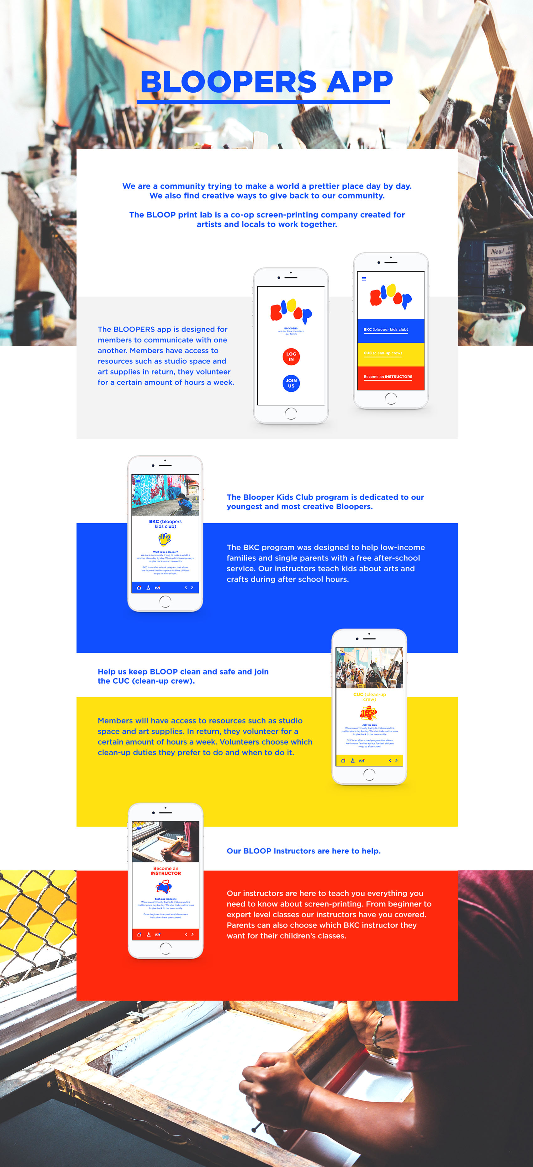
The BLOOP app facilitates communication among its members, allowing them to interact with each other effectively. As part of the membership perks, individuals gain access
to valuable resources like studio space and art supplies. In exchange for these privileges, members are encouraged to volunteer for a designated number of hours per week.
